Product Detail Pages
Takeaways:
- A product detail page (PDP) is a web page providing comprehensive information about a specific product, including details such as color, sizing, and pricing.
- I collaborated with folks from Product, Engineering, Copywriting, and various Stakeholders over a 6-week period to redesign arguably one of our most important pages on the site.
- The redesign was twofold, we wanted to imporove the information hirearchy of the page, while also redesigning to debut our new brand identity.
- The redesign launched before the holiday season in mid Q3 of 2021. Initial expectations were for a 5-10% increase, but the redesign led to a significant 27% increase in Add-to-Cart (ATC) rates.
About the Project
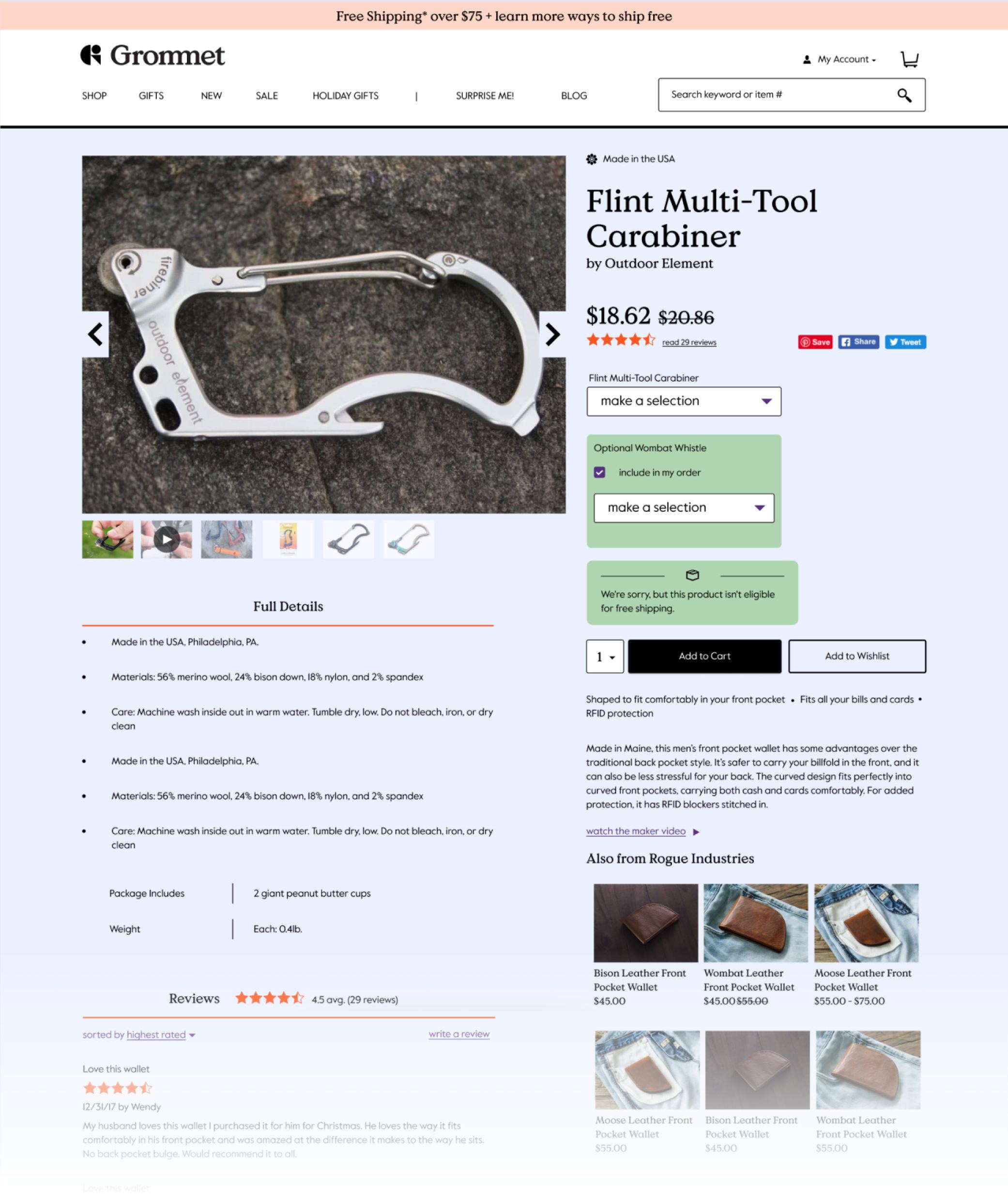
Shortly after joining The Grommet, my first project was to take the existing Product Detail Page (PDP) and update the aesthetics to fit a new Brand Identity that was rolling out, as well as to refresh the overall design and User Experience of the page. This was especially important given the timing was right before the holiday season, our busiest and most marketed time of the year. We wanted to make changes that would provide a better shaping experience without jarring our existing customer base.
The Challenges:
- The assets on the site are a mix of in-house and user-provided photography. Because of this, there is a lot of fluctuation in the quality of the images. Users had also expressed wanting to see larger image examples on the site. We needed to find a happy medium.
- Similarly, all product descriptions, product information, copy, etc. are a mix of in-house copywriter provided text, or business owner provided, and thus had different writing styles and tones. This made it difficult to provide a consistent baseline and strong brand voice.
- The old design had a two-column layout that had lots of competing elements fighting for the users’ attention. The layout also felt cluttered and wasn’t easy to navigate.
- A few third-party systems that connect to the back end had to be taken into account during the design process. They limited how much we could change the underlying grid, and we had to take care not to break anything.
Step 1: Audit
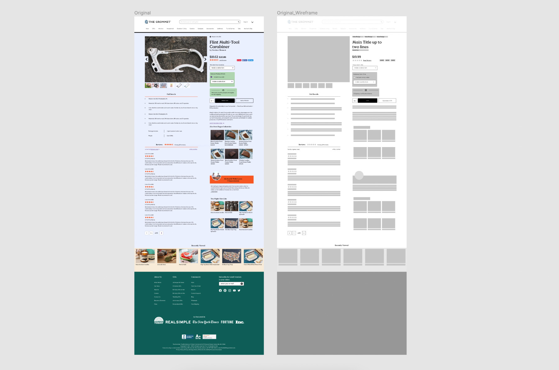
As a preliminary step, I started wireframing the existing page design. I mostly do this to get an inventory of all the items on the page, and to get more familiar with the various elements themselves.
This way of working backward helps me see the page in a different light. Even in this simple view, it should be easy to find the main CTA and easy to scan the page to find whatever information you are looking for.
Step 1.5: Feedback Facilitation
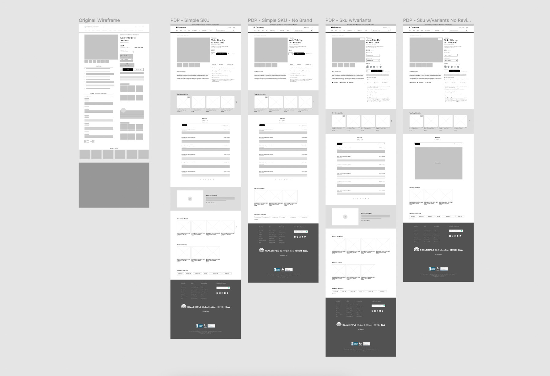
After getting the initial wireframe put together, I decided to move away from the two-column layout and explore a single-column view. This helps improve hierarchy, gives each component its own row, and gives the main elements - the product photography, more space to shine.
In this step, I rearranged sections and consolidated product information. This was a rough reconfiguration of the elements, to facilitate early feedback meetings with stakeholders during our multiple check-in points along the redesign process.
Step 2: Research
Whenever I start any project, I usually check NNG and Baymard for any articles relating to what I’m working on to get a high-level refresh on the elements I should be keeping an eye out for, or to get data on projects where we don't have much user data.
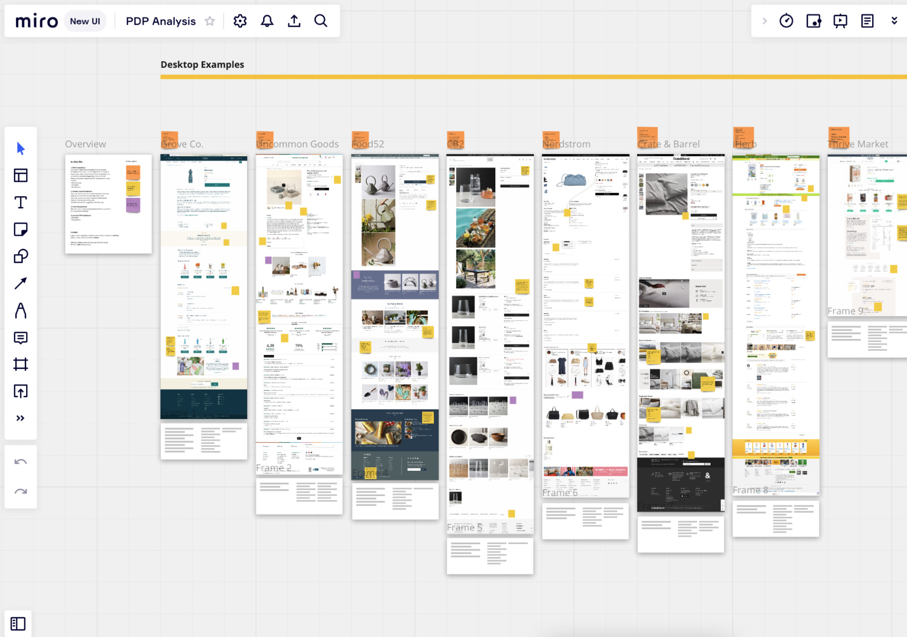
I like to get screenshots of competitors, or similar sites to see how they’ve implemented UX/UI best practices and to see how they’ve built their pages to work best for their brand and audience. I’ll add them to Miro and compile sticky notes with insights that I want to share with project members and stakeholders.
In this case, I listed the hierarchy of the elements on the page to compare the similarities across sites and to find common elements. I also flagged items that might translate well to our use case to talk about them early on and to get engineering insights on the level of complexity of developing the elements to help keep us all on the same page.
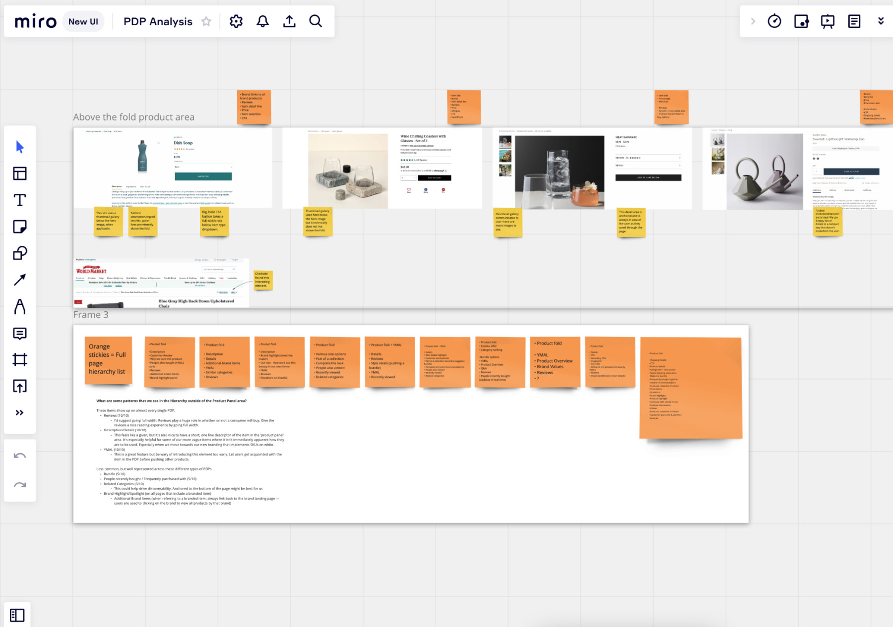
The above-the-fold area is particularly important for the PDP. Since this area is our primary focus during the redesign, I zoomed into the screenshots to call out patterns I found, and essential UI to include, and I also highlighted particular elements we might want to consider for our use case. I wanted to focus on the main elements that help the user get the relevant information they need, in order to help them advance through the shopping process to get them to get that product in their cart as efficiently as we can.
Step 3: Ideate
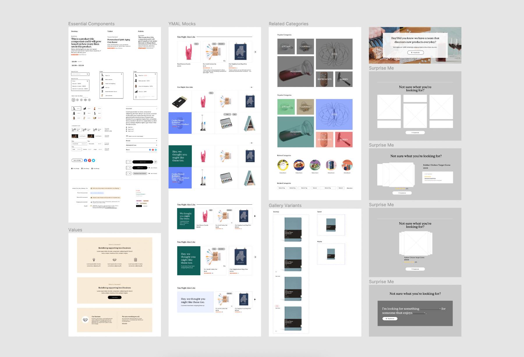
After collecting research and looking into best practices, I started to design the different components with our new direction in mind. Jakob’s law says users spend most of their time on other sites. This means that users prefer your site to work the same way as all the other sites they already know.
With this in mind, I focused on simplifying the page. We already had so much going on in the old design that for our new design I wanted to consolidate information, and make the browsing experience easier to scan, with more emphasis on the star of the site, the products, and product photography. These components also acted as natural “buckets” of information, rather than the spread of information we had in the previous design.
Our new Brand Identity helped steer the direction of these new components with a new look and updated User Experience in mind.
Step 4: Putting it all Together
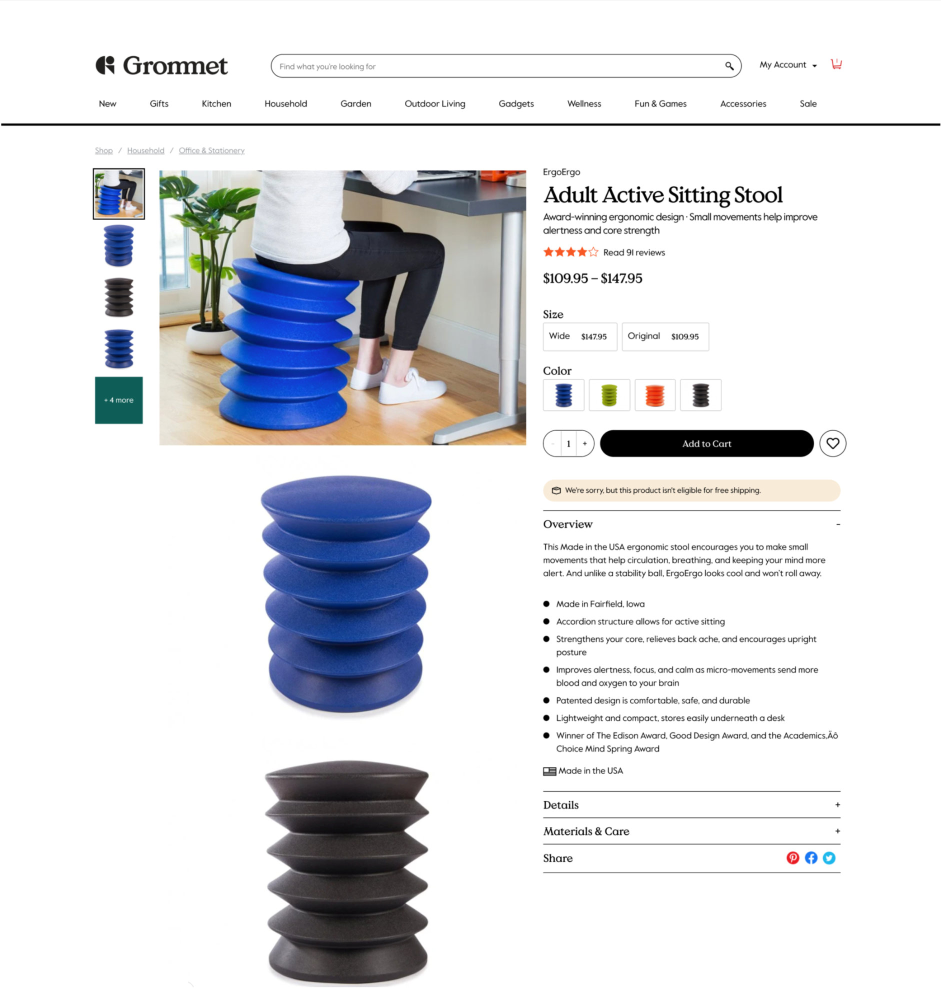
After a few rounds of cross-team meetings, we finalized a new design where we see all our components stitched together to provide a more clear and user friendly PDP.
So what’s changed?:
- We added breadcrumbs to help users “see” where they are in the site. A lot of our first time visitors arrive to our site from a direct product link, this is a nice way to give users context to where they are landing on the site.
- The product images take higher priority and get a larger space with a new gallery. This treatment served as a middle ground between the challenge of showcasing lower resolution user-provided images and our high quality in-house photography.
- The addition of a short description under the product title helps users quickly understand what they're looking at. This is particularly important since a lot of the products on the site are breakthrough innovations that aren't commonly seen.
- Color, size, and various other options are given a more visual treatment vs. the simple drop downs we had. Showing rather than telling.
- Shipping and product alerts were given a slimmer treatment that still stands out but is less intimidating and takes up less space.
- Overview, details, etc. are all specific to this product, so I've grouped them together in a collapsable panel that follows alongside the product gallery, keeping the most important information side by side and above the fold making it easy for the user to find the information they need.
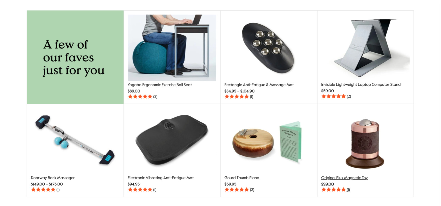
This component is our “You may also like” section. It's main purpose is to be an upsell area where we can showcase relevant products that compliment the main product on the page. This section was very important to marketing, and they advocated for this item to be featured high on the page. We nestled it between the “main” product information and the product reviews, so that it was likely to be seen since our data showed that our users often navigated to the reviews section.
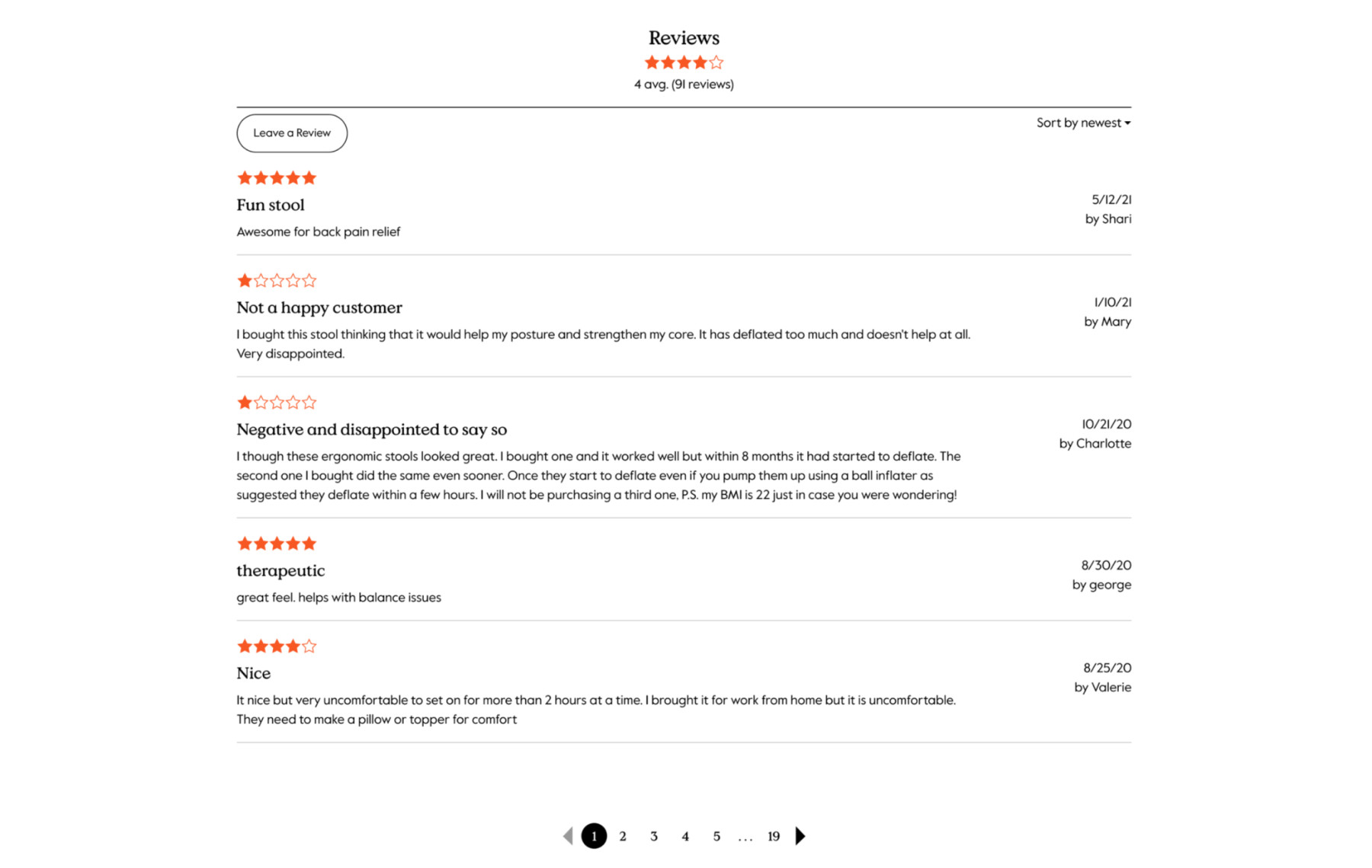
Our reviews section got a new treatment with a full page spread, to give users’ feedback more space to shine. We pumped up the text size to make things easier to read, and updated the hierarchy of the content itself. We planned on implementing a new tool to handle reviews in the second phase of the redesign, so we wanted a quick refresh vs. a total redesign in this case.
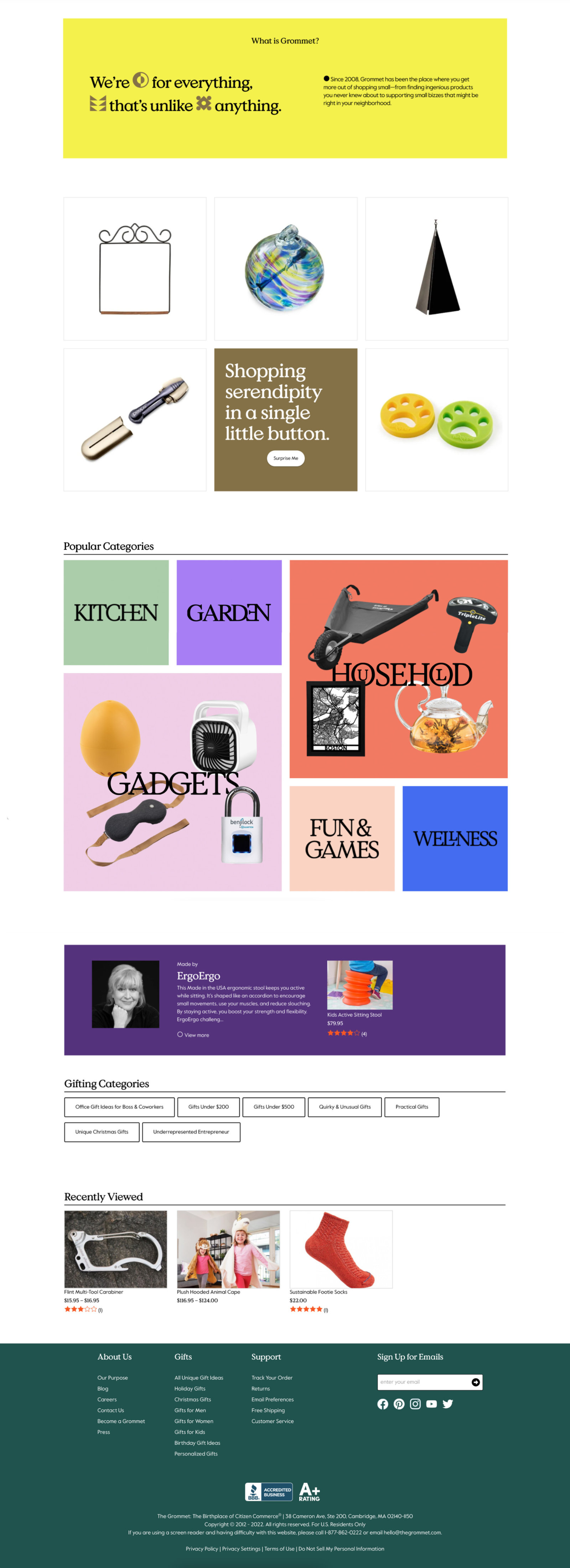
This brand block helps serve as a “brand moment”. Here we get to highlight one of our brand colors, our brand graphical elements known as “Grommets” and a little history about who we are as a company. As I mentioned earlier, a lot of our traffic was landing directly on these PDPs, so it was important to include a section that helped educate new users about who we are.
The remainder of the page was developed by me and the same team, in the second phase of this project. Initially, we wanted to “flip the switch” and go from the old design to the new design overnight. Instead, leadership decided to make incremental pushes to the live site and slowly introduce what I’ve covered in this write-up in a series of A/B tests
In all tests, the new design work won and was pushed to the live site. What was developed below was done in a second phase of the project, mostly to provide additional upsell components that would help the user continue their journey throughout the site.
View a live example here: Adult Active Sitting Stool
